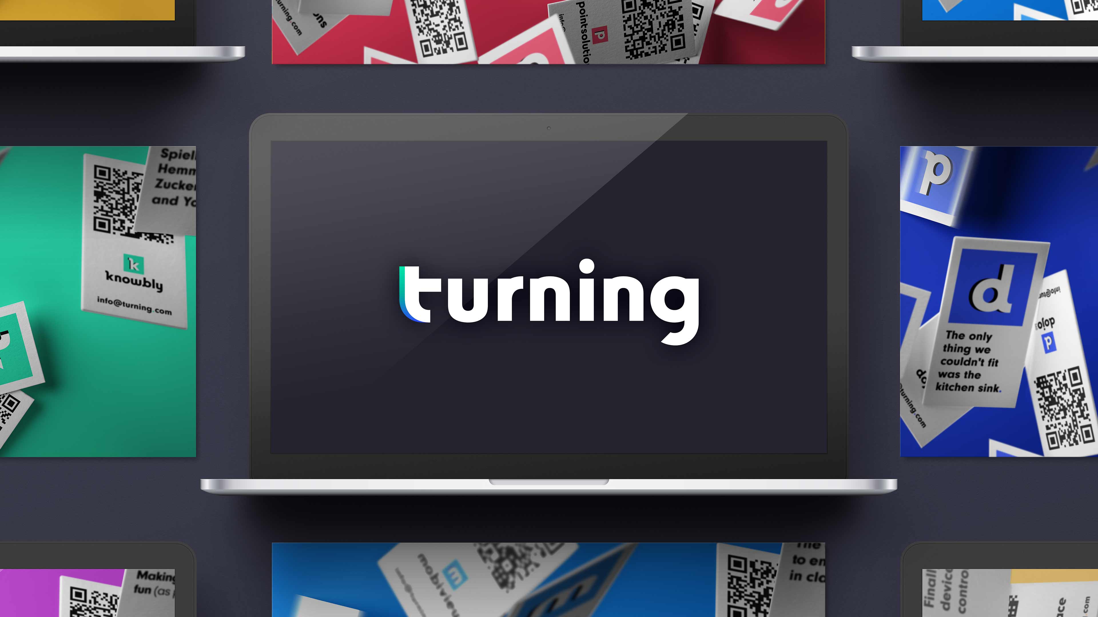
Turning: Brand and product design for an edtech company.

Turning was an edtech company offering a suite of tools for hybrid learning and engagement. I joined the team in 2020 after they acquired Knowbly, where I had been leading UI and brand design. At Turning, I helped evolve their visual identity and led UI design for Dojo360, a new platform built to support both live and self-paced learning.

The Problem

Turning needed a modern, unified brand to bring consistency to its product suite and signal a new chapter of growth. Simultaneously, they were developing Dojo360 — a hybrid learning platform with broad use cases across education and corporate training. The challenge: build a system that felt clear, accessible, and adaptable from day one.

The Solution

I created a flexible brand identity centered around a tile motif that unified the suite visually, with a distinct color assigned to each product and a fluid gradient for the corporate mark.

For Dojo360, I designed a clean, high-contrast UI system that supported both synchronous and asynchronous learning flows. The system met WCAG Level AA contrast standards and scaled across diverse instructional environments.

Business Goals

Redesign the corporate and product brands to feel cohesive and scalable. Build a flexible UI system for Dojo360 that could grow with the product ensuring clarity and accessibility for instructors and learners alike.

My Role
  • Led redesign of corporate and product logos
  • Created brand and product visual systems
  • Designed accessible, high-clarity UI for Dojo360
Team
In-house teams at Turning, including product, design, engineering, marketing, and customer success
Tools
Figma and Adobe Creative Suite

Brand and Marketing Highlights

A cohesive visual identity system unified Turning’s product suite and energized its brand across touchpoints with modernized logos and vibrant marketing campaigns.

Brand Modernization Replaced legacy logos with a dynamic, scalable tile system.

Flexible Identity System The logos work in multiple contexts: stacked, horizontal wordmarks, and standalone tiles. Corporate logo example shown here.

Human-Centered Ads Brought warmth and relatability to the brand with full-page campaign ads featuring learners.

Product-Focused Ads Highlighted Turning’s digital tools in context with clean, device-centered layouts and color-coded branding.

Product UI Highlights

Dojo360’s clean, accessible interface supports both instructors and learners with intuitive tools and a flexible style guide built to scale.

Instructor Tools Course hubs, assignment builders, and class management tools give instructors full control within a streamlined, accessible UI.

Live Class View Real-time teaching tools support interactive sessions, with controls for timing, results, and class engagement.

Student Dashboard Students can track progress, access assignments, and stay on top of their courses with a clear, organized dashboard and intuitive navigation.

Style Guide The product’s visual language is grounded in a clean, high-contrast system built for clarity, accessibility, and consistency across the platform.

Clarity and cohesion.

Thank you for spending time with this showcase. Turning’s transformation was about more than a new logo — it was about creating a visual language that could grow and flex with the platform.

Contact me for a deeper dive into this project and my design process.